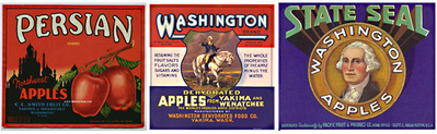
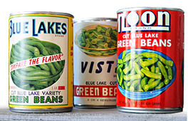
The First Commercially Printed Labels Product labels as we know them today (a piece of paper that is glued to a surface) first emerged in the 1880s. The paper label format grew from the practice of painting directly on crates and tying tags to packages. A faster and more uniform method for marking products was becoming necessary because of a growing economy that demanded consistency and identification. The new adhesive labels were popular on things like pill bottles and fruit crates. Drug labels were some of the first to be developed because of the need to relay vital and accurate information to the patients. Labels on fruit crates were becoming necessary because of the emergence of a nationwide marketplace; oranges grown in Southern California could be shipped to New York and labels were needed to identify them. Early labels served the same purpose as those we see on the retail shelf today, they were meant to outshine the competition, catch the customer’s attention and convey the product and seller information. These early labels are considered collector's items, showcasing vintage marketing and graphic design for many popular brands still around to this day. Be warned though, as with many types of early advertisements, offensive racial stereotypes are unavoidable while searching out your collection. The Original Technology: Lithography in the 1800s With the new adhesive technique, a gum was used to adhere colorful paper labels to a surface. The gum paste was similar to the adhesive we remember from postage stamps and still encounter on many letter envelopes, you had to lick it or get it wet to activate the stickiness. Lithography was the method of printing used by these first label manufacturers and it became the first commercial art; lithography is the process of printing from a flat surface treated so as to repel the ink except where it is required for printing. Stone lithography was the main technique for reproducing art in color during the 1800s; by the 1880s processes such as embossing and shading could be added to enhance the label design. The first label designs often included beautiful images such as orchards and family portraits and very little text. Label costs were still substantial so businesses would often order large runs and use the same label over a few years. Avery Invents the Self-Adhesive Label in the 1930sThe next big innovation in label printing was the self-adhesive label. R. Stanton Avery invented the first pressure sensitive label in the 1930s. These labels came with a paper surface, a coat of adhesive, and a silicone-coated liner. The "sticker" could be easily removed from the liner and stuck directly to a surface, no licking required. The company he founded in 1935, now known as the Avery Dennison Corporation, is still in the business of making labels and has sales in the billion dollar range. In addition to manufacturing developments, the 1930s also saw a change in label design. The image heavy labels were replaced with more text centric labels that were geared towards marketing to the consumer. For example, food labels began to include things like health benefits and ingredients. During the great depression people wanted to be sure they were getting the most value for their dollar so text with promises of what you were getting inside the package swelled. Increased government regulations also contributed to less art and more text on labels. Flexography in the 1950s Early flexographic (flexo for short) printing was originally known as "aniline printing". The name originated with the hazardous analine oil-based inks that were used up until the 1940s when they were banned by the FDA. Safety fears caused analine printing sales to plummet even after new, safe inks were approved by the FDA in 1949. Industry leaders sought to reclaim market share by renaming the printing method, severing any association with analine inks. In 1951 a contest was held by a trade magazine to rename the printing process and the term "flexographic process" was the clear winner out of more than 200 entries. Flexography is essentially a modern version of the letterpress, where printing is accomplished using a rotary relief printing method with flexible plates and fluid inks. It was an improvement over lithographic printing because it could print on thin and flexible materials such as film and vinyl. In the 1950s label designs saw a further shift away from images to bold lettering with a solid background. Think Coca-Cola and Morton Salt. The self-service supermarket enhanced the need for labeling as products could directly reach the hands of the consumer. They could browse the aisles and read the labels themselves rather than request items from a clerk behind a counter. This propelled the "golden age" of advertising in the 1960s, though some would argue we are still in the golden age as the opportunity for packaging innovation and creativity is unlimited. Digital Joins Flexo in the 2000s
Today there are many options for anyone needing high quality vinyl labels. With great advances in quality, flexography took off in the 1990s and remains a thriving printing process that is used extensively in label printing. Digital printing was originally developed in the mid 1990s, but high production costs, limited substrates, and slow press speeds prevented the process from truly going mainstream. By the early 2000s digital printing began to evolve as a viable option for labels. Digital label printing today provides the highest quality full-color labels using inkjet technology. Digital printing is less labor intensive and produces less setup waste than conventional flexographic printing. There are benefits to both digital and flexo, and which one you use is dependent on your individual product and label needs. Today label designs vary widely and can include everything from retro to modern and simple to complex. The current quality of label printing, combined with special finishes like embossing, foil stamping, and varnish treatments, make today's labels the most versatile and effective packaging ever. And, creating and printing stellar label designs has never been easier. If history has taught us anything, more innovations in technology and design are just around the corner.
3 Comments
When sending and creating artwork, it’s important to know the difference between raster and vector art. When possible, vector art is preferred, as it will give you the best possible image quality. When raster art is used, such as in photos, ensuring it is sent at 300dpi will give you the best possible outcome. Not sure how to tell the difference? Here’s a breakdown: Vector ArtWhen possible, copy should be supplied as vectorized art (curves) and/or editable text so that resolution is not an issue. Vectorized Line Art is art created in a drawing program such as Adobe Illustrator. Line art consists of shapes and lines that can easily be manipulated by grabbing points (nodes or anchor points) and adjusting them (see the selected star shape in illus. A & B). Colors can be applied or an outline can be added easily to vector art. Line thicknesses can be increased easily and the resolution is always good no matter what size the art prints at. Trapping and text editing can also be done with ease. In the example below, the background image is the only item supplied as a raster image, the remaining copy is vectorized art or editable text. Raster ArtA raster based application is one in which the art is composed of a "mesh" of squares called pixels. Each pixel is made up of a certain number of colors. These are referred to as channels. The resolution of a raster image is determined by the number of pixels within one inch (communicated as "pixels per inch" - ppi). There are several ways to describe files that are set up with a certain number of channels or resolutions, and this is what makes communication of digital artwork very confusing. Raster art is typically created with programs such as Adobe Photoshop.RGB VS CMYK WHEN TO USE WHICH AND WHY As a designer, it is essential to know when to use RGB vs CMYK – CMYK: cyan, magenta, yellow, and black (In the printing press days when plates were being used the black plate was typically call the “key” plate because it carried the important key information relating to the artistic detail.), and RGB: red, green, blue colors on projects. A good rule of thumb is anything dealing with the web should always be in RGB and printed material should be in CMYK. But very few designers and clients know why this is the standard. Here’s why… Back in the printing press days, to achieve color, each ink (cyan, magenta, yellow, and black) had its own plate. First the printer would lay down one color, wait for it to dry, lay down another color, wait for it to dry and so on. Printing presses still work on that same theory to this day with the exception that offset printers can use a “spot” color which can be added to achieve a specific color swatch (usually a Pantone color). As the printing age has progressed, the digital printer has come a long way, allowing to print in RGB as well. But the standard still stays the same – use CMYK on all printing needs, as the color will appear differently if printed in RGB. On the other end, computer monitors give off colored light known as RGB (CMYK is colored ink). Computer monitors have a larger color gamut than printing, which is why a computer can display a million more colors than what can be achieved with printing. Printing deals with absorption and reflection of wavelengths of which we perceive as color (CMYK). Printing also has its own limited color gamut. A lot of times customers will note that something looked different on screen than it does on paper and it is because of the different color ranges that computer monitors and printing allows. To go into further depth, RGB colors are also known as “additive color”, because there are no colors and the colors are being added together to achieve further colors or until the outcome is white (look at the color chart image directly below, the inside color is white because it is all the colors added together). This is because our eyes receive no reflected light and they perceive the color to be black. However, when you add portions of red + green + blue the outcome is the CMYK colors as shown below. While in return, subtract cyan – magenta – yellow – black and you will get the RGB colors. CMYK colors are subtractive for this very reason that it starts with all colors and when colors are subtracted the outcome is white (see below color swatch, the inside color is black). This is because the colors absorb the light. To further summarize what has been discussed, when it comes to deciding to use RGB vs CMYK, first figure out what the output will be. If the output will be on a computer monitor then RGB is the way to go. If the piece will be printed, CMYK is usually the standard and the best option. Thats all there is to it when it comes to using RGB vs CMYK colors on your projects.
|
AuthorPetie Petunia Categories
All
|